In the previous entry, I posted the newest pictures of Mai and now, in this entry, I will upload the pictures that were also taken yesterday but with a totally different style : Sadness... Moreover, I also tried to experiment a new style in editing picture called Infrared Film Effect. In these pictures, I do not only want to capture the pictures but I also want to catch the feeling, the emotion of Mai before she goes to Australia: .....
Saturday, August 30, 2008
The Last Shots for Mai model
Saturday, 30-August-2008. This day is a very special day since I took the last pictures for Mai model before she immigrate to Australia.
Since last semester when I have started to take pictures. Mai is the model who is very famous on Yahoo 360 with nickname : tokngan that impressed me much because of her profession. Moreover, she always gives me advice to make my pictures better. However,next Saturday, 6-Sept-2008, she will immigrate to Australia therefore these following pictures could be the last shots that I took for Mai.
Place: Trung Son- Phu My Hung
Date: 30-August-2008
Photographer: Khuong Tran
If you want to see the previous pictures of Mai, you can visit my 360 Yahoo Blog:
360.yahoo.com/tn_khuong
Saturday, August 23, 2008
Completed Portfolio Assignment
This is my portfolio assignment, I spent almost 2 weeks to finish it. This is probably not an easy work for me. I had so many problems and errors etc because in this assignment, I use tween motion instead of using action script.Moreover, I spent a lot of time and effort to do this assignment therefore I am proud of it despite the fact that it is not so nice Y_Y. Actually, after finishing this assignment, I don't have to touch Flash any more because I am tired now and I am scared of Flash even though the final big project is coming. I need time to refresh my mind to have more ideas for the Final Project.
Note: Because my portfolio is quite big, so please be passion if you want to see my work
Friday, August 22, 2008
Taking Portrait photos with Wide Angle
As we know that, in photography, people usually take the Portrait pictures with tele angles to highlight the model by making the background blur. However, by using tele angles, the model is the dominant object in the frame, therefore the picture look narrow and the model look so lonely. For example:
In these pictures, even I gave space in front of the model to make the pictures become wider but the pictures are still look narrow and the models are still look "lonely".
Last weekend, I had a chance to take pictures for my new friend at RMIT Vietnam. I had a chance to experiment a new way to take portrait picture, I used Wide Angle! ( the following picture was taken with 17mm focal length, f2.8)
In this picture, the background is not blur so the there are much more detail about the environment therefore the picture look more interesting. Moreover, I can combine the low angle with the wide angle to make the model look much taller.
Experience:
- Don't combine high angle with wide angle in the portrait pictures, because that combination make the model look extremely short.
- Be careful in choosing the background. Because the background can not be blur much so we have to choose the background that is simple, united and not so colorful.
reference: http://tinhte.com/forum/showthread.php?t=87589
Sunday, August 17, 2008
Porfolio Assignment
After 2 days "flashing" i finally almost finished my gallery, i put 18 images in this gallery(i will adjust some more art works to complete it tonight). At the beginning i use the high resolution pictures and their quality is so good but after a while i realize that my web run really slow even when i run it on my Mac. i checked the size of fla file and i was shocked because it was 150MB!, i have to reduce my picture to 800x600 and then my web run smoothly. Actually, I really love my gallery over the other parts. First of all because this is the most challenge part in my portfolio, secondly, you can see my best works in the gallery where i put the photos that i like most and the design works that i have done from Semester 1.
Now I have to start to do the intro. This part is quite difficult for me, because i have had a clear concept for my intro.
I wish that i can show you my portfolio as soon as possible. Even though my portfolio is not very creative and attractive, i am proud of my works.
Now I have to start to do the intro. This part is quite difficult for me, because i have had a clear concept for my intro.
I wish that i can show you my portfolio as soon as possible. Even though my portfolio is not very creative and attractive, i am proud of my works.
Friday, August 15, 2008
Portfolio Assignment
Actually, I have spent whole last week just to do flash, I spent a lot of time to do this assignment but what I have gotten is not that must. I am so tired now, there are the others works from other subjects that i have not finished. This is the snap shots of my portfolio, it is very simple, I use 3 color: black, red and white as the main colors of my portfolio. And I put the photo that I took into the background and it changes every almost 5 second by using fade in/ fade out effect. I only use the action script that I learned from Ms Li Ping in class, I searched the other action scripts on the Internet but they are quite complex for me so I cannot understand and I cannot know how to use them. So I decide to keep my portfolio web simple but clean. Enjoy
Saturday, August 9, 2008
Photoshop Technique: The easiest way to make a photo brighter.
In Photoshop there are many ways to make a under exposure photo to be back to its right exposure for example we can use curve or level as we learned in DIM2 class. But these solutions are quite difficult for the beginner. That is the reason why in this entry I will show you the easiest and fastest way to save an under exposure photo through out only 3 steps.
This is the original photo, as you can see, it is under exposure.
Step 1: open your photo with Photoshop, and then duplicate the original layer
Step 2: change the blending mode of the new layer to Screen mode
Step3: edit the opacity of the new layer until you are satisfied with your photo's exposure.
This is the photo after edited, actually it look so bad on the your screen because the blogspot does not provide an exact color of my photo. Just experiment on your own display.
Friday, August 8, 2008
Maybelinne New York Ad
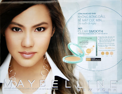
In this entry, I will analyze Maybelline- New York Poster that I find out on Vietnamese Student 2! Actually, this poster analysis is my work from Business Enterprise 2 (BE2) class that I have to analyze a poster of my company’s competitor. When I analyzed that poster, I found out that it was not applied the design principles but it also uses the promotion strategies to catch the attention of the viewers and convince them to buy the product.
First of all, I want to explain a little bit about the promotion strategy that is applied into this poster.
That strategy that is called Buyer Readiness, there are six steps in that strategy
1) Awareness: make consumer know who you are
2) Knowledge: tell consumers about your products/services
3) Liking: makes consumer like your product
4) Preference: make consumers prefer your product over the others
5) Conviction: make consumer believe that they make a right choice when they buy your product
6) Purchase: make consumer buy your product
Knowledge: The cycle that is placed next to the model is the sub dominant object in this ad give the viewers fully of information about the product: the technology that the company apply to that product, how does this product make works and makes women as beautiful as the model in this ad.
Liking & Referencing: Actually these two steps come together at the first time when the viewer look at this poster. Go back to the Awareness step, the beautiful model attracts the viewer and the slogan makes them more curious to this product, the word New York inform the readers, especially Vietnamese people who like the foreign products and believe that they always have good quality that this product came from the US and the quality much be good. Next, the cycle gives the readers a lot of information about the product, the technology. Then the price appears suddenly, and it is very clever to put the prices in the end. After being attracted by much information from the beginning, the viewers should be very excited and when they see the price they should thing that that price is acceptable because they don’t have time to compare the price with other brands. In fact, this product is not cheap; it is around 10.000vnd more expensive than the other brands.
Conviction: just to make sure that the readers will buy this product, Maybelline add a small powerful sentence under the price “there are three different colors that are suitable for Asian ladies”, “suitable for Asian ladies” make the Vietnamese viewers think that that product is not only has the US quality, new technologies but it is suitable for Vietnamese ladies.
First of all, I want to explain a little bit about the promotion strategy that is applied into this poster.
That strategy that is called Buyer Readiness, there are six steps in that strategy
1) Awareness: make consumer know who you are
2) Knowledge: tell consumers about your products/services
3) Liking: makes consumer like your product
4) Preference: make consumers prefer your product over the others
5) Conviction: make consumer believe that they make a right choice when they buy your product
6) Purchase: make consumer buy your product
Awareness: Using rule of thirds emphasizes the model and she is also the dominant object in this poster. Therefore, at the first look, this beautiful model attracts the viewers, after few seconds, the viewers would ask themselves why does this beautiful ladies appear on this magazine? And then The huge word MAYBELLINE NEW YORK catch the view of the viewers and show them that this is the ad of Maybelline that come from New York. But this company could not guaranty that everyone could know what is Maybelline therefore the company added a slogan under the word MAYBELLINE which is “ maybe she is beautiful naturally, maybe because of Maybelline”. By reading that slogan, the readers have an idea that Maybelline is a cosmetic brand.
Knowledge: The cycle that is placed next to the model is the sub dominant object in this ad give the viewers fully of information about the product: the technology that the company apply to that product, how does this product make works and makes women as beautiful as the model in this ad.
Liking & Referencing: Actually these two steps come together at the first time when the viewer look at this poster. Go back to the Awareness step, the beautiful model attracts the viewer and the slogan makes them more curious to this product, the word New York inform the readers, especially Vietnamese people who like the foreign products and believe that they always have good quality that this product came from the US and the quality much be good. Next, the cycle gives the readers a lot of information about the product, the technology. Then the price appears suddenly, and it is very clever to put the prices in the end. After being attracted by much information from the beginning, the viewers should be very excited and when they see the price they should thing that that price is acceptable because they don’t have time to compare the price with other brands. In fact, this product is not cheap; it is around 10.000vnd more expensive than the other brands.
Conviction: just to make sure that the readers will buy this product, Maybelline add a small powerful sentence under the price “there are three different colors that are suitable for Asian ladies”, “suitable for Asian ladies” make the Vietnamese viewers think that that product is not only has the US quality, new technologies but it is suitable for Vietnamese ladies.
Saturday, August 2, 2008
Flash Exercises
In this entry I will post the two Flash Exercises in DIM2 class. In both two Exercises, as the introduction of Ms Li Ping, I don't use the Tween effect to make the movements but I have to change the picture a little bit in the key frame (it is like the way people make Cartoon Films in decade years ago ^_^). The difficulty here is how to make the movements look smooth without the use of Tween effect. Let see how did I do these exercises.
Note: I did have trouble in posting swf file in blogspot. If you want to post the video in to blogspot without uploading your files into the other hosts, export your file into mov file that works perfectly with blogspot ^__^
Subscribe to:
Posts (Atom)