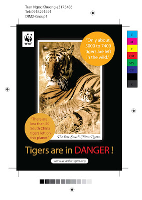
This is the poster that I designed for the 2nd DIM2 Assignment. Actually, when I showed my poster to my friends, they always ask me that why did i choose the style so "kute" and the picture is so peaceful. How could that poster send the strong message to the viewer?. So sad!.
First of all, I will explain why I use that picture for my poster. People usually think that why should they save tigers? because tigers are the dangerous animals and people are scared of tigers so there are few people spend their time and effort to protect this creature. That is the reason why I choose that picture, I want to give the viewers the other face of tigers. The tigers do not only know how to hunt or how to kill the other creatures but they also have love and they also have their own family. For instance this picture show the love between a mother tiger and her baby, she is happy in protecting and taking care of her baby. That's a very beautiful picture about the lives of tigers. I hope that the use of that picture can give the viewers the other view and the other thinking about the Tigers. And after understanding more the Tigers, there would be more people attend to the saving tigers campaign. Secondly, I also add the information about the situation of tigers in the wild, especially South China Tigers, by giving the fact, I believe that these are the strongest messages to encourage people to participate in this campaign.
Tuesday, July 29, 2008
Saturday, July 26, 2008
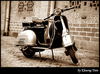
Photoshop Technique: Sepia color
Photoshop again? Yes I do know that 2 Photoshop tutorials in just a week seem to be bored but according to the comments I find out that my Phototoshop Tutorials are quite interesting to my readers so I decide to keep writing a new Photoshop tutorial ^_^
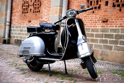
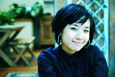
In this entry I will show you how to make Sepia color to a picture. Actually, there are many ways to create Sepia color to a picture, but this one is the way that i prefer most.
Okey, now open the picture that you want to make it look Sepia.
Step 1: first of all you need to turn your picture to Black and White by going: Image->Adjustments->Desaturate
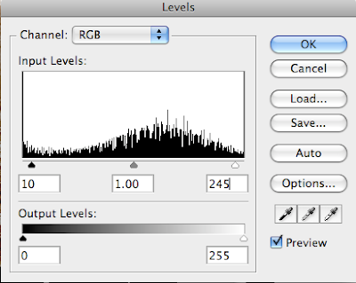
Step 2: press Command+L or Control+L in windows, a tab should be opened. Now you set the Input Levels at: 10, 1.00, 245 and then press Ok button
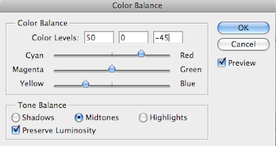
Step3: Go Image->Adjustments->Color Balance, and you set the value of Color Level: 50, 0, -45 and then press OK button
Note: To have a good color, before editing your picture, you could set your picture back to it right exposure by editing its Level, Curve, etc
Friday, July 25, 2008
Photoshop Technique
I do know that we are turning to study Adobe Flash in class, but I am still fascinated with Adobe Photoshop. Therefore today, I want to write about a Photoshop technique that is applied widely in the photography.
This picture above is applied some effect to make it look colder by adding more the blue color. Now I will guide you step by step how to make this effect. Let's start with the original picture.
Step 1: Open the picture with Adobe Photoshop and then Duplicate it by going: Image->Duplicate
Step 2: on the copy of your picture, go Image->Mode->Lab Mode, and then you go to to the Channel tab
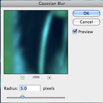
Step 3 (Working on Channel a): click on the Channel a to active it and then you go to Filter->Gaussian Blur , set 5 pixels
Next, you press Command+L or Control+L on Windows, and a tab should appear. Now you set the Input Levels: 77, 1.00, 255
Step 4: Click on the Channel b, for this Channel, you do not need to apply Gaussian blur effect ^_^. Next, press Command+L or Control+L on Windows, you should set the Input Levels: 77, 1.4, 255
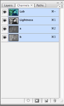
Step 5: you should select all the channel in the the Channel Tab( as the picture below)
And then, press Command+C or Control C on Windows to copy these channels
Step 6: go back to your original picture, and then press Command+V or Control+V on Windows to paste
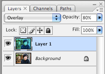
And then you set the Mode of new layer to Overlay, and then you would set the opacity from 60% to 80 %.
Friday, July 18, 2008
Photography
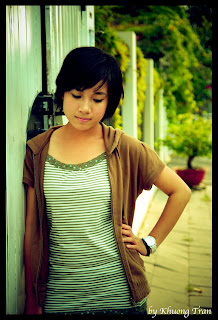
I have fallen in love with photography since last semester when i started to learn how to use DSLR camera in ME1 group. Then i was spending all my time during the break between semester 1 and semester 2 in taking photos. Further, portrait is the genre that i chose to enter to the world of Photography since it is quite easier for me than the other genres. In this entry, i will post the pictures that i like most, some of them i have never shown before in any website or blog.
The pictures below are the original picture, they are not touched by any application
Tran Nha Trang: she is my girlfriend. She helped me passionately in the first days when i enter to the world of Photography. Actually, in these days, i did make a lot of mistakes and i did not know how to pose model etc but she always motivate me and help me being better.
Mai: she is my most professional model, she is usually goes out to be the model for the professional photographers therefore she act creatively and naturally in front of the camera. Unluckily, she will immigrate to Australia next month. I am really sad since she is not only a excellent model but she is also a very good friend.
Van: i met her the first time when we studied together in L6.1 class. Even though she was acting in front of camera for the first time when i took these pictures, the way she act is so natural and creative.
Tuesday, July 15, 2008
Illustrator
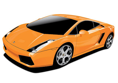
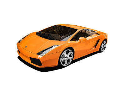
This is my first work on Illustrator. I traced this Lamborghini in almost 20 hours by using just 12 layers. I do know that the more layers I add the more detail the car is but I will have more difficulties in managing these layers and my computer probably run extremely slow. That is the reason why I decided to keep the number of layers small. Next, the most difficult parts are filling color and how to make the car look realistic. In fact, when I traced this Lamborghini, I had many difficulties on drawing the shadow and the reflection so I spent almost 5 hours to play around with the effect tools and then I found out that the Gaussian Blur, the Feather Affect and the Opacity tool could help me solving these difficulties easily. And to help you having a better comparison, I also post the original picture of this Lamborghini. As you can see, there are many details for example the refection on the windows of the car that i cannot draw in illustrator
Tuesday, July 8, 2008
Photoshop Technic ( Only for Photoshop CS3)
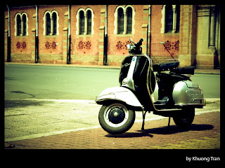
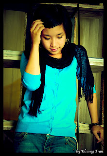
Okay, in this entry i will give you a brief introduction how to use Photoshop CS3 to edit JPG file as RAW file ! (how cool is it!). After that, i will show you how to use this fantastic feature to make the effect as the picture above.
First of all, to archive this feature:
1) In Mac OS X: Photoshop->references->File Handling->File Compatibility-> check the box Prefer Adobe Camera Raw for JPEG files. Press OK
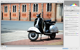
2) Open a JPEG file, you should see the box below. This is the powerful tool to edit RAW file ( but now we can use it to edit JPEG file ^O^)
Now look closer to the right of this box you will see the Tab that allow you to modify picture. I will show you step by step how to go throw these Tabs.
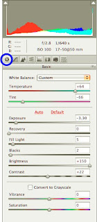
Basic Tab:
Because the picture is not clear so i will write down these values and u just follow my instruction ^_^:
-Temperature:+64
-Tint : -66
- Exposure: -3.30
- Recovery : 0
- Fill Light: 5
- Blacks: 2
- Brightness: +150
- Contrast: +22
- Vibrance & Saturation: 0
Go to the next tab
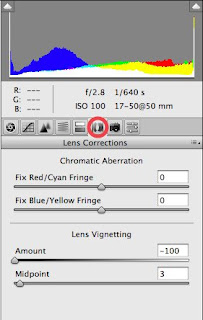
Lens correction:
Lens vignetting: used to make 4 corners of the picture brighter or darker. In this case we set 4 corners darker (to focus to the object)
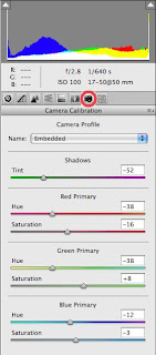
Camera Calibrication:
With this tab you can set the value of your image in 3 different channel colours: Red Grenn Blue
Shadows
Tint:-52
RedPrimary
Hue: -38
Saturation:- 16
Green Primary:
Hue:-38
Saturation:+8
Blue Primary:
Hue: -12
Saturation:-3
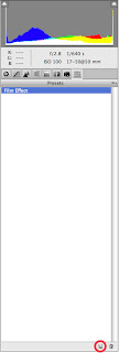
Presets Tab
By using the Presets tab, you can now save your settings for the next pictures.
Press the button in the right bottom ( next to the Trash).
IMPORTANT: If you now click on the Open Image button, Photoshop CS3 automatically modify your original pictrure!. To avoid that, press the alt button on your keyboard , the Open Image buuton will change to Open Copy, click on that and Photoshop will apply your settings to a copy of your original picture.
Now you can add border to your picture (by using Canvas Size tool) to make it look more professional.
Reference: Chỉnh tone màu ám xanh – phim nhựa :http://vnphoto.net/forums/showthread.php?t=17329
Bonus: Mai Model
Basic composition in Photography: Rule of Thirds
After going around and reading my friend's entries, I find out that I write too much but not focus to the topic, so I have to change my style T___T
Today, I will write about the Rule of Thirds in Photography. This rule is applied in Photography as the basic knowledge about composition that every Photographer has to know before having any beautiful photos.
These rectangular are divided by two horizontal and two vertical lines (the blue lines). These lines that separate the rectangular into 3 equal area meet together at 4 points (the blue points).
In Photography, these 4 lines are called the 4 strong lines, and the 4 points are named strong points.
To emphasize the object, the photographers have to set the object as close as possible (or match) to the 4 strong line and 4 strong points.
I will use my photos to illustrate how this rule is applied into photography:
When I took that picture, I want to emphasize the flowers therefore I tried to set the flowers on the strong points and the strong line instead of putting them into the middle of the photo.
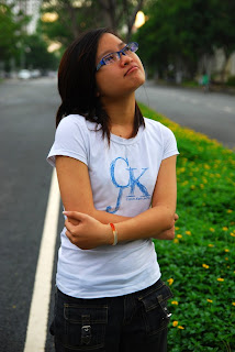
Okay, this picture was not taken by me (of course! because I was the main character in this picture^). As you can see, the 2 models were posed on the horizontal strong line therefore they are emphasized effectively. Moreover, the other horizontal strong lines also highlight the sky above.
To sum up, people usually assume that putting the objects into the middle of the picture will highlight the objects but it is not correct.
Thursday, July 3, 2008
Hi as i said in the previous entry, today i am going post my work on Clone Stamp Tool and Healing Brush Tool in Adobe Photoshop.
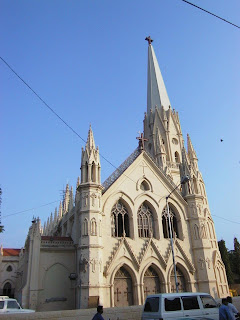
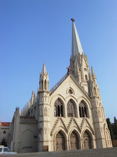
As you can see, this is the original picture that is tangled by the electric wires, the streetlamp, antenna, and the bird in the sky. Moreover, the car and two motorbikes also hide the doors of the church, and there is a little yellow crane at the right side of the church. These things are probably making the viewers confused and uncomfortable when they look at that picture.
My job is giving back the beauty to the church by removing this mess. It is extremely easy if I use Eraser Tool and erase everything out of this picture but it is probably destroy the picture. Therefore I have to use the other tools
After three hours hard working, I finally finished that work. Instead of using Eraser Tool I use Clone Stamp Tool and Healing Brush Tool and the reason is these two tools can make the picture look natural, soft and difficult to be discovered as an edited picture!
The electric wires, the birds and the yellow crane are easy to be removed. The streetlamp is a little more difficult. However, the doors and the wall in front of the church are ultra hard to deal with because they are hidden by the car and the motorbikes. Therefore I have to fix them slowly, patiently (actually I did have to zoom in to 800% to work with each pixels Y__Y).
Experience: I did have a lot of difficulties when I did this exercise just because I don't have a GOOD MOUSE T__T. Actually; this work requires the meticulousness so I have to be accurate in every "clicks". However my mouse makes me crazy when I even cannot control it. Buy a good mouse before you do these works is probably not a bad idea.
Wednesday, July 2, 2008
Welcome to my first entry
This is the place that I will not only update my art works regularly but I also reflect my experience, my thinking about the world around me. In fact I have to post two entries per week or I have to write 20 entries in next 10 weeks. Therefore I am going to work hard to meet that requirement and also to satisfy my readers.
After studying two classes of Adobe Photoshop, I find out that Photoshop is not as difficult as I thought. During the break between Semester 1 and semester 2 I do hate Photoshop! Since I don’t know how to use that complicated software. I took a lot of pictures but most of them get wrong exposure or bad composition! And I did not know how to fix them (poor me Y_Y). However, now everything is difference since I can use Photoshop to bring my photos back to their right exposure, add new effects to make my photos look cool or I can get a good composition by dropping them ^0^. Okay let me show you what can I do with Photoshop now :)
This is the original picture that was taken in May-20-2008 in Phu My Hung and the model is Tran Nha Trang who is now studying B.Com semester 2. As you can see that this picture has many errors. First of all, it is under exposure since that day was a cloudy day but I set EV-0.3. Secondly, the composition of this picture is not good too because behind the head of the model there are many branches T_T. Don't laugh at me, I had learned how to use camera few days ago in ME 1 class.
I use Level Tool (image->adjustments->level) to bring this picture to its right exposure. In addition, I also add a little more contrast and saturation (I tried to make it look like a commercial photo) ^O^. However, I did not stop working here, keep reading and you will see that I did adjust fell more interesting effects on this picture.
This is the final work and I do love it (of course! because it is my work ^^). First, the Extract filter helps me separates effectively and easily the model and the background behind her. Next, I used Photo filter to change the background into old style. Then the blur motion set off the model and makes the branches behind her softer. Finally, the picture becomes more professional with the black border.
To sum up, after studying two classes I have learned many valuable Adobe Photoshop techniques that I can apply to make my photos much better than before. Furthermore, I am now fascinating in "playing" with Adobe Photoshop which was the software I did hate most in just few weeks ago.
The next entry will be the work on using Clone Stamp Tool and Healing Brush Tool in Photoshop.
Subscribe to:
Posts (Atom)